

By Mikhail Karadimov July 23rd, 2015
American movie posters are boring, drab, insipid. Heads float, flying spaceships crawl across the surface plane in an unexciting diagonal, bodies and names and credits commingle in one big orgy of blah. They’re uninspired hodgepodges of “tried and true” marketing techniques, hackneyed techniques, dusty, provincial rules that bore. Look anywhere else, look to Japan or to Italy or to the Netherlands, and you see posters busting with creativity. These posters transcend tired marketing trends and hit the mark of “art” by transporting us to another dimension, another planet, a world that we would never otherwise imagine.
All the artists, ad men, and studio heads in charge of posters should offer us a taste of that otherworldliness every chance they get.
That’s why I love Polish posters so much.
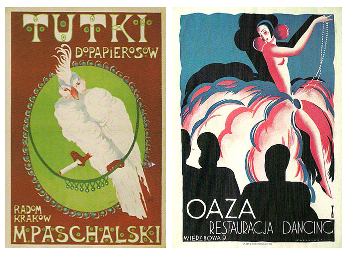
As discussed in Andrea Austoni’s wonderful piece on the history of Polish poster art, Poland prides itself on their plakaty (Polish for “posters”). They have a hundred year relationship with the art form. Dating back to the late-19th century. And it all began with advertising. With product pushing. But Poland, at the time, wasn’t even on the map, they didn’t have much of an identity, and sought one through art. With influences from Japan and Europe, Polish artists like Stefan Norblin and Tadeusz Gronowski applied their artistic know-how by creating prints that pimped trips to Poland, washing detergent, tires, and radiators and cruises and so on.
At no point did any of these artists begrudge their medium: advertising. Instead, they took it as an opportunity to flourish, to exercise what they had learned in art school or from other foreign artists and influences. However, it wasn’t till the architects arrived—as well as their Warsaw professors, Zygmunt Kaminski and Edmund Bartlomiejczyk—along with their hands-on practicality, their push for graphic design, that Polish poster art finally took root as its own form, its own amalgamation of all the applied schools of art that came before. It transformed from a narrative medium to an advertising medium and then to an artistic one.
It was in the 50s and 60s—after a wave of post-WWII propaganda rose, crashed, destroyed, and rebuilt poster art—that Polish plakaty finally reached their zenith, their Golden Age. As soon as Stalin died, along with his tight hold over Poland, once poster work became state controlled—as was the film industry—and people realized that poster work was their sole means of artistic expression (since the state didn’t give a shit about posters) schools fractured and broke off into splintered groups prompting artists to let loose and produce whatever stoked their fancies. (Mind you, just so everything remains in perspective: Saul Bass—the artist responsible for the posters of Anatomy of a Murder (59) and Vertigo (58)—was the only American poster artist who operated under the same levels of freedom. A freedom considered rare in the history of American poster art.)
Posters splashed the streets of Poland with color and reprieve—reprieve from the oppression set by the country’s communist regime of the 50s and 60s. It was an opportunity to lighten up streets, the same way our imaginations are still lit five decades after the fact.
Unlike Polish plakaty, American posters are primarily obsessed with names. First and foremost—even though the start system is quickly fading out—it’s about the faces, the familiarity. Posters superimpose actors’ and actresses’ faces onto a surface plane and don’t think about whether or not the film’s story or concepts come across. Not everyone cares about who’s in a movie if the movie’s ideas are garbage. Furthermore, there’s no mystery when it comes to American posters, nothing to marvel at. It’s all out on the table: “This is a movie. These are the people involved. And here is the title. Thank you for your money. See you soon.”
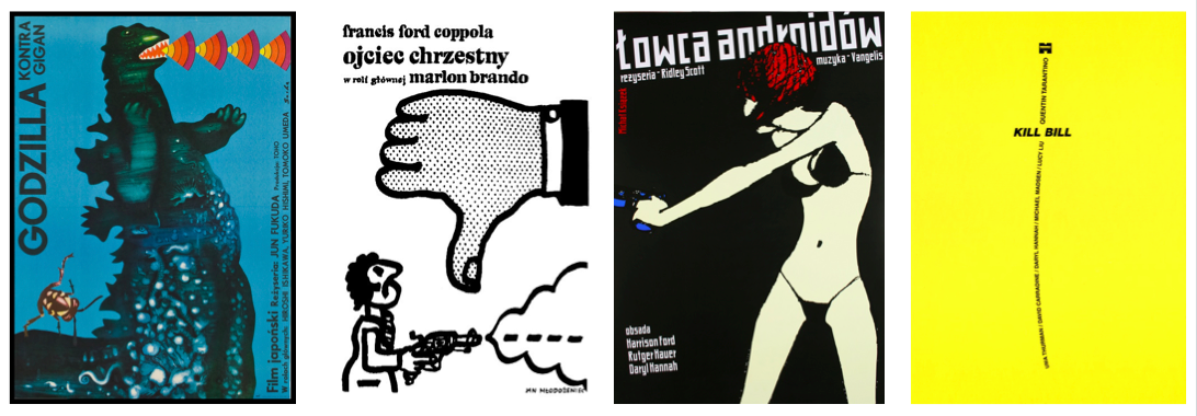
However, Polish posters like to captivate the eye with artistic intrigue rather than unabashed salesmanship. They allure the viewer with abstractions, puzzles, hints of what might or might not be in store for them. Even more tantalizing is the inspiration behind the posters—or rather, the drive: what motivated these artists to go out of their way to create such beautiful ciphers. It means—and this is all conjecture—that the artist was somehow moved enough by the film to sacrifice their time and effort to put brush to canvas and create. So, inherently, this means that there’s already something about the movie that has moved at least one person to invent. So, it goes to reason: why wouldn’t it move others, too?
In other words: there’s no reason for these artists to waste their time with movies. Instead of drafting up strange and peculiar graphics for movies that have nothing to do with them or their financial stakes in life, they could spend their time cultivating original work that would be their own, their stamp, their ticket to posterity. It would be their name dominating the product, rather than someone else’s movie, someone else’s ideas. Because: if it’s a poster—rather than an original piece of art—the poster remains enslaved to the movie, not the artist, whereas the original piece would forever belong to the artist and his or her outlook.
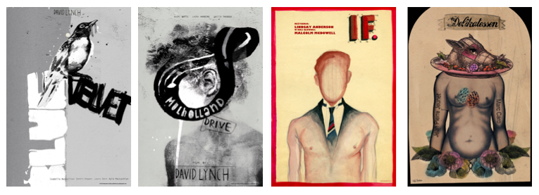
To this day, there are Polish men and women in the motherland upholding the tradition, reworking posters for more contemporary classics like The Big Lebowski (98), Mulholland Drive (01), and Lost in Translation (03). Many of these posters were designed only several years ago, some of them this year. Posters are treated as a legit and artistic medium in Poland, unmoored by stately art school dictums and philosophies. These people—people like Marcelina Amelia and Marta Szmyd, or Jerzy Skakun and Joanna Gorska—don’t care how old a movie is, even if it’s a movie as old as Charlie Chaplin’s City Lights (31), it doesn’t matter. What matters is that the movie spoke to them, that it doubled as a springboard and propelled them into new images, bold images, images that—on any given day—seduce me more than any American studio or poster ever could.
Join the Conversation on Twitter